I.
INTO THE WORLD OF SHREK
“Research & Watching The Film”
III.
LACQUER COLOR PALETTE DEVELOPMENT
“Incapsulating Shrek, Culture & The Times”
V.
CAPTURING THE MOMENT
“Photography & Visual Merchandise”
II.
BUILDING ON SWAMPY FOUNDATION
“Finding A Theme: The Swamp”
IV.
PACKAGING & WEB DESIGN
“Web Layout & Graphic Design”
VI.
LOSING OUR GUMDROPS
“A Good Team Makes The Job Easy”


William Steig’s Original Shrek Design
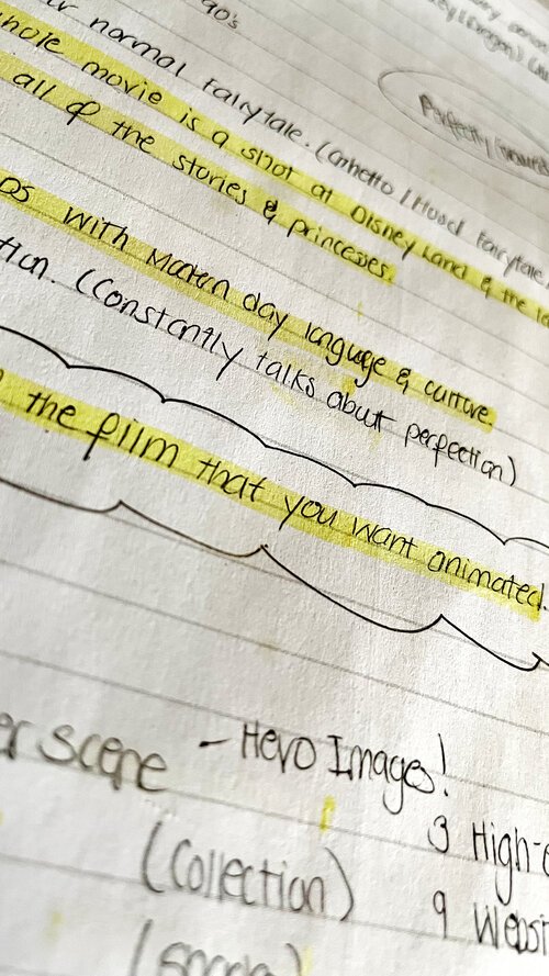
George Santayana so famously said, “Those who cannot remember the past are condemned to repeat it.” This principle, although not as dramatic, can be applied to the creative space as well. A big part of being creative is originality and when it came to the Shrek franchise, the team did not want to do what was expected of us. We wanted words like elevated and innovative to be normal speech amongst media outlets by the time this project was completed. To do so, we needed to dive deep into the world of Shrek and that meant: reading “SHREK!” by William Steig, watching the films 1,000 times, watching the spin-off films, the televisions series, looking at holiday specials, video games, maps and so much more.


Map Courtesy of Bapabooey from shrek.fancom.com
Lapierre is a cosmetic brand that markets itself on sexiness and maturity. So, the challenge was keeping true to the theme of the franchise while also making it attractive enough that consumers in the beauty industry would want to use it on themselves. After a few weeks of trying to normalize “Shrek”, it hit us! The “beauty” of this franchise is that Shrek breaks most societal norms. Just think about it! Shrek is an ugly, ogre who doesn’t ride a trusty steed but, has a talking donkey. He doesn’t have money or flashy cars but, a swamp and when he saves the beautiful princess, instead of him now becoming a handsome prince, normal, she becomes an ogre. And people gravitate to it! Why?… because, we can relate! Not all of us are the handsome princes of the world, instead we feel like the ogres of society. We’re not all pretentious princesses waiting to be saved but, fearsome, flirtatious dragons that people are too intimidated to love. Some of us are just the annoying jackasses (donkeys) that everyone hates but, can’t live without. Once we realized all of this, it was easier to embrace our inner misfit, jump in the mud of the swamp and get down and dirty.


Swamps are defined as areas of low-lying, uncultivated ground where water collects. This collection of water is known as bog or marsh and is usually made up of earthy hues. Shrek, the character made it his duty to protect his swamp and William Steig’s book never really explores outside of that space. So, we wanted to keep the swamp a pillar amongst many when building our castle known as, “Shrek-ish”. Because the swamp is a natural ecosystem, there wasn’t an issue finding colors amongst the swamp that would correspond, because nature has already been created in a way that does that for us.
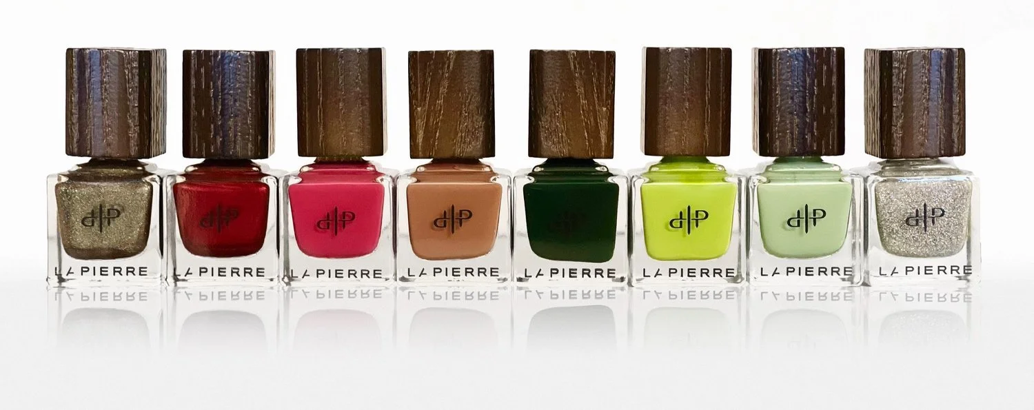
Though, there was an issue of finding colors/hues that would sell. The classic yellow-green of Shrek was a must. That took care of the animated, fun part of the design. We also wanted something classy and professional as well for our older consumers and that’s when we found the dark green above. A color rooted in Scottish, royal history, easy on the eyes, mature and found in the swamp. This gave us that contrast… that pop that we needed; all while avoiding straying away from the leading colors in the classing Shrek “S” logo everyone knows and loves. If you look hard enough, you’ll notice the dark green and yellow-green (colors to the left) permeating through all of our creative works. As previously mentioned, the dark green color has a long history amongst the royal elites. A dark green door or interior usually indicated prosperity and wealth. Therefore, this color became a common color amongst European style homes. It can even be found in the Black Watch “Am Freiceadan Dubh”, Scottish tartan plaid pattern. Fortunate enough for us, our big green


friend sports a fine Scottish accent; which meant creatively we were moving in the right direction. Mixing culture and fashion, with beauty and cosmetics added a level of seriousness to the project and we were okay with that. I mean… who doesn’t want to feel part of a royal family while wearing the latest nail polishes?


Once Brandi nailed the 8 lacquer colors, it was time for me to hammer down the packaging design. First step was researching animation & cosmetic collaborations that have be done in the past. I’ve noticed that in collaborations like these, most brands lean on the strength of the notability of the main characters in order to sell products. Although from a marketing perspective, I understand the strategy’s effectiveness, my job is not just to sell products but, to do so whilst staying on brand.


Using CG [computer generated] images of the Shrek characters would get people’s attention but, does… not… really… scream sexy or mature. Taking all of this into consideration: character inclusion, box size, and colors; I settle upon the packaging you see today. A slim, matte, dark green, box, with UV-raised and embossed, yellow-green line-art so that you can feel the characters that aren’t so obvious to the eye. As a small business, it’s no surprise that some of us ended up wearing several hats during this process. In my case, I’ve steered the creative direction; as well as created the graphics you’ve seen on the website, social media and inside your packaging. This allowed for a level of consistency, that I don’t think would’ve been found in this project if separate parties would have worked on these creative aspects. Because, of the beauty driven style of the packaging, that classic Shrek ‘CG’ artwork was missing. In order to fill a hole that I’ve create, I simply inverted my thinking. I went into the packaging wanting to make Shrek more LaPierre but, now it was time to make LaPierre’s website and social media platforms more Shrek. So this creative process began with me creating the skeleton of the site that you see above.
Then, once I figured out the placement of the characters, I began sketching the 6 (technically 7) images you see below. My goal was to recreate iconic moments from each film in the franchise but, to do so in a way that shows the genius and relevancy of Brandi’s lacquers. For example, in the first film, Shrek passes gas while taking a swamp bath and bubbles float up. I figured that having the lacquer floating in a bubble makes an excuse for the polish to be in the air, while also shining light on Shrek’s repulsive lifestyle. In the third film, we’re introduced to the Dronkies (Donkey & Dragons’s children). I began to notice that whenever Dragon blows a kiss to Donkey, it creates a smoke heart around their family. What better way to connect these oddly, paired… love creatures than to use the smoke hearts from the film? In the last film, where Shrek signs Rumple’s “Contract of A Lifetime”, there is a small moment where The Muffin Man is treating Gingy like a chicken in a curbside cock fight. In very Gingy fashion, he fully embraces that role and goes full Spartacus on the animal crackers he’s fighting. Being a fan of Spartacus, I gravitated toward that moment and knew it had to be recreate. There are so many things I could tell you. I could go on forever about connections and Easter eggs I’ve thrown into this project but, part of being a great artist is creating something and leaving it there for others to interpret. So, I’ll do just that.


From the Royal House of Pendragon to the Throne of LaPierre, princesses are not only known for their outer beauty but, for the things deep inside: their kindness, bravery, compassion, confidence and whit. After many years, rewatching the films and laughing as if it was my first time watching, I wanted to capture what fans have always loved about Shrek, the humor. We completely absorbed the non-traditional storyline and humorous characters to encapsulate all that “Shrek” brings to the table into the collection. From the greenish hues of Shrek and his swamp to the brightness of Rumpelstiltskin's angry wig, we wanted to creatively capture the beauty and awkwardness of some of our favorite characters. This bloomed into a collection that transcends seasons and once we saw the beautiful shades all lined together, we knew we nailed it! No pun intended.
“Sherk was such a monumental game changing animation that brought so much humor. This New Orleans girl, in a swamp of my own, loved the non-traditional story line.” - BB


When Brandi first told me about this project, I was ecstatic! I grew up watching Shrek and to have the opportunity to create imagery for a collaboration with Dreamworks was exciting. I was and still am a fan of all that the franchise has done. Ofcouse, out of all that they have created, Donkey as a character comes out on top. Which is why, my favorite shades of polish are Ba-Donkey Donkey and Dragons of Duloc. Even my favorite image this project is the one with Dragon and Donkey’s respective polishes in the Volcano Castle setting. If you ask me, he completes the movies. But, let me not jump the gun. Let’s start from the beginning. When it came to creating the images, I drew inspiration mainly from Shrek I and Shrek 2. From the scenes in the woods, to Fiona’s castle where she was being held captive, to the town of Duloc and so much more. I took parts from these scenes in the films and incorporated them into each aspect of my photos. The key was imagining each product as a character and placing them into the scenes I recreated; where they were present in the movies. I aim for quality so, using fake plants and moss wouldn’t do. You would be able to tell it was fake and I didn’t want people to get that feeling. I wanted them to feel like I had captured these images in the world of Shrek. Even the cement blocks, smoke, and succulents are all real. As you can imagine, this made for a few challenges. One major challenge being, overdoing the props. Less is more! And too much going on in a scene can make the image look messy and directionless. So, sticking to the plan and staying calculated was of high importance during studio time.